Tuesday, May 7, 2024

Coldness of the Sun, oil on canvas 2023

I live in a place where Winter begins in late October and doesn't end until sometime in late April or, like this year, early May. As much as I love hiking, riding my bicycle, swimming, log hours of daylight, and being able to draw outdoors without getting frostbite, I also enjoy the Winter. It is peaceful and somber and, although the climate can certainly test one's mettle, it's breathtakingly beautiful. Life goes on beneath the blanket of snow and ice. I took up snowshoeing two years ago and I enjoy it immensely. Because the days are so short in Winter, I have often found myself trekking around the wilderness as the sun is setting. As the already frigid temperature drops and the light disappears, I am immersed in an ominous darkness that I find remarkably calming.

This composition and color arrangement, although not of a specific place, was inspired by my many snowshoe excursions. I wasn't conscious of it whilst working, but I see now that I was trying to convey the feeling of quiet optimism that I get from the Winters where I live.

How I Need You When You're Gone, oil on canvas 2023

I have a fondness for emotionally charged, saturated colors in my work. Paintings by the Fauvists and German Expressionists, Van Gogh, and the Northern California Colorists of the early twentieth century like August Gay and Seldon Gile always resonated with me. I like the directness of a strong color and I relish the challenge of finding interesting ways of establishing relationships, either harmonious or discordant, between two or more strong colors. But I also love the subtlety of these almost "non" colors and near-greys that are seemingly drained of vitality. Working with these colors presents different challenges because their lack of saturation makes them very similar. They tend to look the like the same grey on the palette but once they start to interact with each other on the canvas, their subtle differences assert themselves and the take on characteristics of green, violet, orange, etc.. These colors are also effective for conveying emotions, but in a quieter way. This painting has a sadness that I like very much. I struggled with this painting for several weeks, as I tried to get the sense of space that I wanted. Those dull oranges showed up in the final hour and pulled it all together.

Now and Then, oil on canvas, 2023

My first encounter with a Mark Rothko painting was at the Museum of Modern Art in NY when I was in college. I may have heard his name before, but I was not familiar with his work at all. As soon as I saw the painting, I was overcome with a profound sense of peace and my eyes teared up. I could not have explained with words what was going on in that painting, but as stood in front of it, I understood exactly what the artist was doing. It was a life-changing experience and the first time (of many yet to come) that I was moved to tears while looking at a work of art. I have shown slides and pictures of Rothko paintings to many students and tried to explain, with limited success, his work to them, but there is no substitute for standing directly in the presence of the paintings. When you stand directly in front of a work of art, you are in the same place relative to the work that the artist was in when they created it and you see the actual surface and the materials that the artist touched with their hands and their tools and the size of the art relative to you is the same as it was to the artist. Great works of art emit their own energy and when you stand in front of one, in an almost symbiotic relationship, you share in that energy. Rothko certainly knew this and creating that experience for the viewer was principal in his intent when creating his paintings. The same can be said about the difference between experiencing a live musical performance compared to listening to a recording. Reproductions of art are certainly important and essential learning tools and they allow us to see art from all over the world, but I believe that it is important to see as much art in person as possible.

I have mixed feelings about posting images of my own work on the internet. On one hand, I want people to see my work and to be able to get an idea of what I do, but when someone looks at a postage stamp-sized digital image of one of my paintings, they are not really looking at the painting. The surface texture and scale of each mark that I made is completely lost, even though the composition, value relationships and color harmony may be faithfully represented. But I live in northern Maine and if I want people to see my work at all, it's a sacrifice that I must make.

Wednesday, May 1, 2024

If You Ever Change Your Mind, oil on canvas 2023

(Private Collection)
People often make a distinction between "Realistic" art and "Abstract" art. Arguably, every work of art is an abstraction. The artist extracts characteristics from their subject and transforms them into something else. Oftentimes, the difference between Realistic (Objective) art and Abstract (Subjective) art has to do with the amount of information (often refered to as "detail") the artist conveys. If the artist's primary concern is the conveyance of information (e.g. an illustration for a medical procedural or a portrait commission), they must collect as many facts as neccessary from their subject and transform those facts into visual form, leaving little room for interpretation on the part of the viewer. On the other hand, the artist may be less concerned with delivering facts and may, therefore, be more free to use their imagination, culling what they may from the subject and asking the viewer, in turn, to use their imagination, as well.

Just a Moment, oil on canvas 2023

(Private Collection)
The impetus for most of what I do is usually nothing more than an impulse. I don't imagine or think about a picture before I start working. I usually begin with a color and then a line or a shape without considering it, but once I make that first mark, once I violate the sanctity of the blank page or canvas, I'm engaged. There is now something to react to and every subsequent choice that I make is a reaction to all of the previous ones. To an outside observer, it may appear that I am simply working intuitively, yet each decision that I make is informed by decades of experience and study. In many ways, the process is similar to a conversation wherein one person says something, the other person responds, the first person responds to that, and so on. Both people engaged in the conversation are working towards a resolution, following their thoughts and feelings while also attempting to follow the thoughts and feelings of the other. If the interlocutors are both fluent in the same language, the conversation will flow continuously to it's natural conclusion, even if this means working through some disagreements. Painting and drawing, for me anyway, are very similar to this. Having fluency in the language of visual form and the technique that allows me to turn my ideas into visual form, are both necessary in order for me to engage in the process. This is not to suggest that the process is easy. On the contrary, I often run into roadblocks. Something happens in the work, and I find myself at a loss for how to respond. Struggle ensues and I either figure it out or I don't. These challenges do not just keep me interested in the work; they are the reason that I do it. I certainly struggle less than when I was younger, but it is still challenging. If I ever found drawing and painting to be easy, I would likely stop doing it.

Friday, November 17, 2023

Sentinels, oil on canvas, 2023

I made a small (10" x 8") painting based on this idea, which came from a pastel drawing that did from memory after first drawing this subject in graphite from direct observation. Thus, this larger canvas (36" x 30") is four times removed from the original subject. My initial inspiration, however, is manifested more in this painting than any of the other, earlier works. The reason for this is that an objective representation of the visual attributes of the subject is of very little importance to me. I'm much more interested in creating an image that represents my emotional response to the initial encounter with the subject. The further removed I am from objective description the better.

I always have difficulty with the word "realism" when applied to art. Typically, a work of art that looks exactly like the subject is refered to as "realistic" but, as far as I am concerned, nothing could be more artificial than a painting that doesn't look like a painting.

Thursday, September 28, 2023

Remains of the Day (oil on canvas, 2022)

I have spent many thousands of hours drawing from direct observation. For me, it has been a way to both develop technique and, more importantly, to develop fluency in the language of visual form. When you stand before a subject with a blank surface and some type of mark-making instrument you are faced with an almost infinite number of ways to translate what you are seeing into some kind of visual form. What parts of the subject to include in the composition and how to compose the subject within some kind of a frame, whether to use a linear approach or to use shapes, how to render the value relationships, whether to use objective colors as you see them or to use a more creative, subjective approach to color, how much detail to include or to draw in a more abstract, suggestive way. Grappling with these myriad choices is an inherent part of the drawing process. A visual artist, when working representationally, can, if they have the skill, render a convincing likeness of their subject but they can also render other content that is not based on optical perception. An artist can suggest emotions, atmosphere and weather, convey a narrative, create a sense of drama, and force the viewer to see things that they might not otherwise notice. All of these elements, including optical representation, are communicated through the use of visual language using lines, shapes, values, textures, colors, and the means by which these elements are organized.

For the past ten years or so, I have focused more on drawing in my studio, from memory and imagination, as a method of finding ways to convey “non-visual” elements through visual language. When working in this way, the emphasis is on visually representing the intangible, similar to how a musical composer might convey emotions or narrative through the arrangement of sounds. Although it may seem like a purely self-indulgent act of playing with the materials and seeing what happens, it is actually a much more focused attempt to create a visual representation of something. The struggle, through the process of drawing, is still about representing the subject visually, but the reference is not something that I am looking at; rather, it is something from inside, but the rules of effective visual communication still apply. It is actually more challenging than drawing a subject from direct observation because there is no reference for me to compare my work to. In the end, I am really the only one who can assess whether or not the work is a success.

Tuesday, September 26, 2023

When the Spell is Broken (oil on canvas, 2022)

Everyone will view a work of art in their own personal, subjective way. We bring to the experience of looking at art our own personality traits, history, tastes, prejudices, cultural associations, etc. so it is impossible for two people to have exactly the same experience when viewing a work of art. The same is true when it comes to reading books, listening to music, and watching films. We even have different experiences when we see the same work of art at different times in our lives because we have changed. I saw the exhibition of Andrew Wyeth’s Helga paintings and drawings in 1987 when had just left graduate school and I was underwhelmed by the work. This experience had nothing to do with the work and everything to do with me and what my priorities and interests were at the time, along with my inexperience and lack of fluency in visual language. This past Spring, a student brought a copy of the catalogue to that same exhibition to class and, upon looking through it, I was literally awestruck at the brilliance of the work, made all the more striking because of my previous experience. I immediately got on my phone and ordered a copy of the catalogue from eBay! Studying the work over the Summer, I became all too aware of how much our experience of viewing art has to do with us and not the artist.

Still, an artist who has knowledge of how to communicate effectively through the language of visual form and an understanding of their target audience can construct a work so that the majority of people that see it will have a somewhat similar experience. Oftentimes, this simply involves choosing subjects that are laden with symbolism and rendering them in an objectively realist style or a well-trodden style (e.g. Impressionism) that has obvious and proven connotations.

Other artists, however, choose to create work that encourages the viewer to have a very subjective experience. Their work is intentionally ambiguous. Rather than spoon feeding the meaning to the viewer, they challenge the viewer to find their own meaning in the work. Rather than presenting the viewer with a window that allows them to look out or in on something, they present a mirror, hopefully giving the viewer an opportunity to look inside themselves. Neither of these approaches is better than the other. It really comes down to what the artist’s intentions are. In my own work, I have transitioned away from creating images with fairly obvious meaning to works that are more ambiguous because I want people to have their own unique experience when they view my work. One of the greatest compliments I get is when I paint something from my imagination, and someone tells me that they recognize the place.

Sunday, September 24, 2023

The Days Before You Came (oil on canvas, 2022)

(Private Collection)
When I was studying art as an undergraduate, back in the "20th century" (as my son likes to say when he wants to remind me how old I am!), many of today's common hazardous materials regulations didn't exist. We could use spray fixative in the studios and everyone who painted used turpentine as a solvent and for cleaning brushes. Students and teachers even used to smoke in the studios, although not during classes. By current OSHA regulations, tobacco products, turpentine, and spray fixatives cannot even be brought on campus. I don't miss the cigarette smoke and I have found spray fixatives that don't have the nasty, toxic odor of the ones I used in college (although they cost about three times as much!). Except for when I'm laying down a burnt sienna underpainting, using large house painting brushes, I almost always paint with knives, so I don't have the need for cleaning brushes anymore. When I do, I use odorless mineral spirits. When I have students, I insist that they also use odorless mineral spirits so I can be in compliance with OSHA standards and to avoid anyone having a negative reaction to turpentine fumes. Once, a student brought some kind of citrus based solvent that was supposed to be environmentally safe (according to the label, anyway). The fumes were horrendous and gave all of us headaches and nausea, and the student who brought the stuff ended up losing consciousness. I brought him outside for some fresh air, which quickly revived him and he was fine in the end, but I have since banned citrus-based solvents from the studio.

But I do get nostalgic for the aroma of gum turpentine. I use it in small amounts in my main painting medium (It's a secret recipe, so don't even ask!). Whenever I smell it, I am instantly transported back to my youth as a struggling undergraduate art major with grandiose aspirations of becoming the next Rembrandt or Dürer, whilst struggling to figure out how to paint convincing shadows or to properly compose a drawing. I have bittersweet memories of those days. The many long, arduous hours of labor to produce mostly mediocre works of art were often demoralizing and I had practically no social life or time for other interests. Yet, somehow, I managed to remain optimistic despite my numerous "failures". I tell my students now that they will have to make a lot of bad pictures before they start making good ones so don't look at the bad pictures as failures; they are successes because each one means that you have one fewer bad pictures to make. I know that might sound like a platitude, but I wish someone had said that to me when I was in my early 20s. Not that it would have made much difference, I suppose. I kept working anyway....

From a Safe Distance (oil on canvas, 2022)

(Private Collection)
As a Visual Arts Studio major in college, I was required to take a two-semester Survey of Art course, which was an art history course that provided a cursory overview of the history of Western (mostly European) art, beginning with the cave paintings in Lascaux through some of the art movements of the early 20th century, including Cubism and Surrealism. What I remember most from that course was that we spent an inordinate amount of time studying the architecture of churches and cathedrals. I also had the opportunity to take two additional Art History elective courses. One was a small, seminar-style course on Northern Renaissance Art, and the other was a Modern Art course, which covered the major art movements of the first half of the 20th century. I wanted to take a course on Baroque and Roccoco Art during my last semester, but as a Studio Art major, I was not permitted to take more than four art history courses. My advisor suggested that I talk to the instructor about the possibility of auditing the course. He told me that there was not enough space in the classroom for an additional desk, but he needed a work/study student to operate the slide projector. So I was able to sit in on all of the lectures whilst getting paid for it! Win. Win.

Looking back, those five undergraduate courses probably account for less than 1% of all of the art history that I have studied. I started collecting books about art when I was still a student and it continues to be an obsession. I have hundreds of art books in my house and studio and, with the exception of the pile of recent acquisitions in my living room, I have read and studied all of them. I often refer back to many of my books for inspiration, to revisit topics, or to give students actual of examples of concepts that I am teaching them, or to see how one of the masters may have solved a specific visual problem that I am struggling with.

I believe that artists have a responsibilty to know as much as possible about the history of their craft. This is a lifelong study. We can learn a great deal from the artists of the past who have struggled to find creative solutions to many of the same visual problems that all of us face regularly. Oftentimes, such solutions became new ways of working and seeing, and they can inspire us to persevere in the face of seemingly insurmountable visual obstacles.

Tuesday, May 9, 2023

Everything You've Loved (oil on canvas, 2022)


(Private Collection)

When I was in my fourth year of college as an undergrad student I did an independent study in painting with an instructor named Dan Hill. I would go to his office once a week with all of the work that I had done and we would look at it and talk about it. He would make suggestions, mostly in the form of exercises that would help me focus on development of specific technical deficiences, of which I had many! The exercises were extremely helpful and I would usually do more than what he suggested. One such exercise involved painting a flat red rectrangle, maybe 5" x 3", in the center of a 9" x 12" canvasboard. I then had to paint the rest of the canvas so that it appeared concave behind the flat red rectangle. I repeated the exercise, but with the background appearing convex, and then again with the background appearing to recede from left to right, top to bottom, etc.. Although tedious and difficult, these exercises were very helpful in terms of teaching me how to use color and value to make a flat surface appear three-dimensional and I am still grateful to this day for the time spent working on them.

Meanwhile, I was also attemting to make these ridiculously ambitious landscape paintings that were years (perhaps decades) beyond my technical abilities at the time. Eventually, I scaled back to simple still lifes painted from direct observation so that I could focus on the fundamentals of how to transform oil colors into form, space, and light. Early in the semester, however, I brought in a painting in progress of a filed with round hay bales in it, a barn in the distance, and large cumulus clouds in a blue sky. I had recently purchased a French easel and had taken my painting supplies out into that field, which was only a couple of miles from my house, and painted from observation. I felt like a "real" artist. The painting, of course, was a disaster. On seeing it, Dan Hill suggested that I look up John Constable, who had painted a lot of cloud studies. Neither of us had any idea at the time how precient that was. Constable would eventually become a major influence for me, and I might some day find myself painting clouds in a way that wasn't a disaster.

All Your Broken Pieces (oil on canvas, 2022)


(Private Collection)

Artists who work in two dimensional media (painting, drawing, printmaking, etc.) have to contend with two different types of space in their work.

Decorative space refers to the two-dimensional arrangement of forms on the picture plane. These two-dimensional forms (primarily lines and shapes) can be arranged in such a way as to create balance or imbalance, movement or stability, order or chaos, and to establish a visual heirarchy.

Plastic space refers to the illusion of three-dimensions on the flat surface of the picture plane. When utilizing plastic space, the artist is always either creating the illusion of a solid, three-dimensional form or the illusion of empty, three-dimensional space. It's virtually impossible to have one without the other (although I have seen Mark Rothko paintings that just look like empty space). We create this illusion through the skillful use of visual form. Lines, shapes, values, and colors can be made to appear to be different distances from each other and from the viewer depending on how they are organized within the picture plane. For example, across the middle section of this painting, the cool, dark, blackish violets appear to be farhter away than the warmer red-oranges, giving the illusion of a dense thicket. The yellow, which is actually below, appears to be in front of this area of warm reds and cool violets, thus creating the illusion of empty space between the picture plane and the middle section of the canvas. Of course, all of this is smoke and mirrors; the painting is flat.

When I am working on a painting like this, I am always keenly aware of how the plastic space is developing. I usually begin with a vague sense of the kind of space that I am attemting to create and as the painting develops, I notice how different parts will advance or recede as I work. When I put a bit of color down it will cause other parts of the painting to appear closer or farther away and I am continually making adjustments until I acheive the spatial effects that I want. This can be quite difficult to learn how to do, but there is nothing mysterious or magical about it. It's mostly just physics. Anyone can learn how to do it, although it certainly requires a lot of practice. I am often asked how I know when a painting is finished. That is a complicated question that doesn't have a definitive answer but I will not stop working on a painting until I know that the sense of plastic space is unified.

Monday, May 8, 2023

A Private Little Sun (oil on canvas, 2021)


Painting is a visual art but it can be used to convey much more than visual information. In addition to, or instead of, simply showing the viewer what the subject looked like, an artist can, through skillful use of their materials and a knowledge of the language of visual form, suggest sounds, weather, emotions, movement, texture, and narrative. The elements of visual form - lines, shapes, colors, values, etc. - are analogous to the characters and words in any verbal language. Fluency in the language of visual form can be the means for communicating an infinite number of concepts, both objective facts and subjective ideas.

Of course, a painting can be a means of conveying a wealth of information, describing the appearance of a subject in great detail. This can oftentimes be very useful, but a painting created for this purpose can be thought of as a textbook. Personally, I prefer to think of a painting like a poem, in which common words and phrases are organized in such a way as to evoke an emotion, a feeling, memories, or some fundamental truth that transcends the literal meaning of the words.

Although the inspiration for my paintings comes from places that I have seen, I am more concerned with creating images that represent the way those places made me feel, rather than what they looked like. As a result, the images are decidedly subjective and personal, yet I hope to touch on the universal and create an image that will resonate with each person who sees it.

Monday, October 24, 2022

All That Matters (oil on canvas, 2021)

(Private Collection)
In the Fall of my senior year in college I was beginning to prepare to apply to graduate schools. I wanted to be a painter, but my advisor encouraged me to pursue printmaking instead. Admittedly, my drawing and printmaking skills far exceed my abilities as a painter at that time, as I struggled with the complexities of color theory and color mixing, as well as the technical difficulties of working with oil paint. Still, I really wanted to be a painter. She said something to me along the lines of, "Look, Frank, some people just 'get' color and others, like you, don't. But there are still myriad possibilities open to you as an artist who works in black-and-white."

So I went to graduate school as a printmaker, eventually leaving to pursue a career in music. It was 15 years later when I "decided" (Actually, I was compelled and eventually capitulated only after a long and arduous struggle.) to be a painter and I had to face my insufficiencies as a colorist. If I were to detail the literally thousands of hours that I spent studying color theories, making color scales and charts, transcribing works by other artists, meticulously mixing colors to match the colors they used and trying to understand why they used them, and making hundreds of terrible paintings that went straight to the trash bin, you either wouldn't believe me or you'd think me insane. Eventually, though, through sheer tenacity, I figured it out. I teach courses in color theory for artists now and most of the issues that I help painting students with have to do with color. When students are impressed by my ability to look at any color and quickly mix an exact match in paint, I oftentimes find myself telling them the story of what my advisor told me. Many of them are horrified and say that my advisor shouldn't have said that to me because she might have discouraged me from following my dream of becoming an artist. They are wrong. I will always be grateful for what she said to me because firstly, it was true - I had an incredibly difficult time understanding color and my paintings at the time demonstrated this – and secondly, I saw it as a challenge and therein I found the will to overcome my deficiencies, which, I can assure you, was no small feat. And I never “dreamed” of becoming an artist. I don’t even know what that means. Dreaming is something I do during the brief moments that I sleep. As I already mentioned, I was compelled to paint. I usually follow up the story by telling students, especially the ones that are struggling with color, that if I was able to master it, anyone can.

And to anyone who “dreams” of becoming an artist, my advice would be: Wake up and get to work.

Friday, December 4, 2020

Don't Be Afraid to Miss Me (oil on canvas, 2020)


"Ideas come spontaneously and the discipline required to evaluate and put them to use tends to be the real work.” - Stanley Kubrick

To a visitor, my studio probably looks like a chaotic, cluttered mess. There is work all over the place - taped to every wall, stacked on tables, chairs, and windowsills, stuffed into storage compartments, in piles leaning up against the wall, and scattered about on the floor. There are also art materials - pencils, charcoal, pastels, paints, and various papers - close at hand from anywhere in the room, and at least half a dozen empty coffe mugs. Although it may seem unorganized, especially if you are of the personality type that likes order, for me it is a fertile ground for creativity and for generating ideas. Occasionally, I will host a group of students for a studio visit, and will have to clean up the space (usually an exorbitant amount of work!). Afterwards, I find it difficult to get back into my normal creative frame of mind.

The ideas for my images are never the product of thinking. They arise from working. In between the times when I am actively engaged in a large painting, my work generally consists of me just picking up some art materials and starting to draw. Sometimes I take my materials outside to draw. Other times I simply work in the studio. I find the process of exploration and searching through the fog for an image to be an essential part of my practice. It requires a great deal of focus because I have to always be aware of how the image is developing and listen to my instincts for clues as to which direction to take the image in.

The process isn't entirely instinctual, though. There is a lot of problem solving going on, albeit mostly at a subconscious level. These are visual problems that usually have to do with getting all of the components of the image to work together in a unified way, to create a sense of space that is cohesive within the context of the image, and creating an overall color harmony that conveys whatever emotional content I am trying to communicate through the image. Because every part of the painting affects every other one, and every time I add (or take away) anything, even the smallest bit of paint, the entire image changes. This can easily become a complex act of visual juggling and it requires fluency in the language of visual form and mastery of one's tools, materials, and techniques to be able to pull it off. It's a bit easier these days than it was years ago but it's still a challenge and can sometimes feel like I'm engaged in a battle to the death. My studio is lettered with the carnage of many of the battles that I have lost.

Thursday, May 28, 2020

Sometimes Noise Is Beautiful (oil on canvas, 2020)


The older I get, the more I realize the importance of trusting my instincts. They have never been wrong, but there have been times when I chose to ignore them because I didn't like what they were telling me, only to invariably end up regretting it.

I struggled with this painting for a few days until I got to the point where I just wanted it to be done so that I could move on to the next one. This is a small canvas (16" x 12") and I had an idea for a large painting that I was eager to begin working on. I decided that this was finished and headed off to bed, but as I walked back to the house from my studio, I felt this nagging feeling that the painting could be better. I tried to ignore it and went to bed. When I returned to the studio the following day, the feeling was still there. I really wanted to move on to the bigger canvas, but I chose instead to trust my gut and return to this one. I laid the canvas on the table and scraped most of the paint off and began the work of trying to bring the image back in a way that I would be truly happy with. 

In the end, I am glad that I persevered. The ghost of the original painting that was left on the canvas after I scraped the paint off added a layer of spatial density that is very effective and those red-violets, which I really like, were not in the early incarnation of the painting.

In any creative endeavor, one must have patience. In spite of our hard work, some ideas will only come to fruition in their own time and an artist must allow for this. 

Thursday, February 27, 2020

Intentionally Lost (oil on canvas, 2019)


(Private Collection)

I grew up in an enclosed neighborhood that was surrounded by woodland – the remains of what were once an apple orchard and a large farm. Throughout this vast track of uninhabited land ran a network of divers paths, some well-worn and wide enough to drive a tractor through and others so narrow that one would regularly have to push the undergrowth aside in order to pass. Some of these paths could be accessed by advancing beyond the terminus of any of several dead-end streets in the neighborhood whilst others, less conspicuous, could be found behind various houses, through a break in one of the rock walls that surrounded the neighborhood and cut through much of the woods. I can remember, as far back as the age of four, wandering these paths and venturing into the woods to explore, – something that I continued to do until I left my childhood home in early adulthood. In the ensuing years, I have continued to take long walks or runs into uncharted territory wherever I lived or travelled. My current location in northern Maine, where I am surrounded by tens of thousands of acres of uninhabited land, has proven to be ideal for me. The allure has always been the prospect of expanding my boundaries and confronting the unknown.

Traversing beyond our boundaries into unfamiliar territory is a necessary part of personal growth and is sacrosanct in any creative endeavor. As I have continued to evolve as an artist, I have found it increasingly more appealing to enter into the creation of an image without much of a plan and to allow the image to unfold as part of the process. Of course, this requires a solid foundation in both technique and the language of visual form in order to navigate my way through the process. I wouldn’t head out for a ten-mile hike without water and proper shoes. But I still want to be challenged by the art-making process and I want to be surprised as the image comes to fruition.

In many ways, the act of painting and drawing feels the same to me as when I wandered around the paths surrounding my neighborhood as a child as probably why I am so drawn to landscape motifs in my work.

Tuesday, October 22, 2019

Letting Go (oil on canvas, 2019)


(Private Collection)

I must apologize for neglecting my blog over the past few months. In addition to spending quite a bit of time working on a large scale mural for a friend, I have been busy experimenting with new color possibilities, in hope of expanding my vocabulary into uncharted territory. I have been painting for a long time and I have found that about every three years or so, usually as soon as start to gain confidence in my methods, I am compelled to go through a process of artistic rebirth, pushing myself to experiment with new ways of working and seeing. I thrive on the challenge of not knowing what my work will look like until it is finished and I have always been inclined to avoid complacency in every aspect of my life. During these periods of rebirth, which can last for several months, I work a lot, but my focus is on experimentation more than creating finished work. I used to feel guilty that I wasn't producing enough but I have learned to accept these gestational periods as a natural part of my process, just like the frigid, bleak winters that I experience here in northern Maine are a integral part of the cycle of nature that produces such wonderous beauty during the spring, summer, and autumn.

Here is a painting that I did back in July. I am quite pleased with it, but the seeming effortlessness with which it came together forced me to realize that it was time to make painting difficult again. I was about to begin work on a new painting but I felt that I already knew what it was going to look like when it was finished, which for me, is reason enough to rethink everything about my artistic process.

Friday, May 31, 2019

Absolution (oil on canvas 2019)


(Private Collection)

When I was an undergraduate in college the painter Richard Sheehan came to the campus as a visiting artist for a day. He gave a slide presentation of his work, after which he fielded questions from the audience. I was enthralled by his work, mostly cityscapes and suburban neighborhoods, many characterized by views looking through underpasses, all of which showed both impeccable draughtsmanship and compositions that were both inventive and flawless.

But what really struck me was his use of color which, although highly effective, had nothing to do with the local or perceptual color that I, at the time at least, associated with representational art. The paintings were filled with bright yellow skies, acidic lime green trees, and deep ultramarine shadows. During the question and answer period, I asked him how he chose the colors that he used. He basically said that he chose the colors that “worked for the painting”. I honestly had no idea what that meant, but not wanting to seem like an idiot, I smiled, politely thanked him, and sat back down in my seat.

I pondered his answer for years, especially when I took up painting again after a hiatus and happily rediscovered Richard Sheehan’s work on the newly launched internet.

I eventually understood exactly what he meant and realize, in retrospect, that I could never have understood the lesson until I had made (literally) hundreds of paintings. Each color in a painting is affected by and affects every other one and getting all of the colors to work together toward creating the overall image is arduous work, especially since each color seems to have a personality and will of its own – some vying for dominance and refusing to get along with the others or to back down when another color asserts itself (and they can often be both seductive and manipulative!), and other colors that just want peace and harmony. The artist's job is to bring all of this potential chaos under control and to hopefully create an arrangement of colors that looks (in spite of the oftentimes immense amount of effort and struggle involved) inevitable.

After Me (oil on canvas 2019)


Occasionally, I get asked about the titles of my paintings and what they mean. As a visual artist, I am primarily concerned with creating an experience for the viewer via visual means and I don’t want words to influence how the painting might be perceived or to tell the viewer what to see. However, I do need some way of identifying the paintings and differentialting them from one another. I know one artist who simply titles her paintings with consecutive numbers. If the last painting was “145”, then the next one is “146”. This seems like a logical way avoiding the problem of titles altogether, but it wouldn’t work for me. If someone said that they liked my painting called “223” I would have no way of knowing which painting they were talking about. The same problem would arise if I had hundreds of “untitled” paintings.

Years ago, my titles were essentially descriptive of the subject and/or the time of day or year that it was painted. If you scroll back far enough in this blog you’ll find paintings with titles like “Hay Bales at Dusk” or “Henderson Barn on a Cloudy Day”. But, in recent years, I have moved away from images that represent specific places or subjects and thus have had to find a more appropriate way of naming my paintings without spoonfeeding any content to the viewer.

My solution to this dilemma has been to keep a list of words and phrases that I like, picked up from books and poems, song lyrics, conversations, movies, etc., that could potentially be used as titles. I used to keep a hand written list taped to the wall in my studio but it recently migrated to my phone. (I’m slowly crawling into the digital age!) When I finish a painting I go to the list, pick something for a title, and then cross it off the list. Titles are constantly being added to and deleted from the list. The titles are intentionally ambiguous and rarely have anything to do with the content of the image (and if they do, it’s covert and allegorical and not something I would share with anyone) but are meant to be open to a wide range of interpretations by the viewer.

My daughter saw this painting and asked me what it was called. I told her it didn’t have a title yet, to which she responded. “Name it after me.”

As it turns out, that was one of the titles on my list (I’m not going to tell you where it comes from.), so it seemed only fitting to use it. I’ve always been one to embrace serendipity.

Tomorrow Never Comes (oil on canvas 2019)


Apparently, I have become a landscape artist, although when I was learning how to draw and paint, landscape was never an area that interested me very much. My love of Rembrandt once had me thinking that I would be primarily a figurative artist and after discovering Giorgio Morandi during my senior year of college, I spent years painting nothing but still-life subjects. It was my move to rural northern Maine that fostered my penchant for landscape subjects. I have always liked to spend a lot of time outdoors, not just drawing and painting, but walking, running, cycling, and hiking. The world I live in now is about 99.9% landscape and reminds me of the woods and farmland that once surrounded the neighborhood that I grew up in and where I spent so much time during my formative years.

There are several aspects of the landscape that appeal to me as an artist. The ever changing light and color, which are always perfect, provide a bottomless well from which to draw both knowledge and inspiration and can give the same subject a different appearance as each hour passes into the next. The delicate balance between order and chaos which exists everywhere in nature is something that I strive for in my work as well. Beneath what can appear to be a savage and violent disarray of forms is a system of such complexity as to defy human understanding. I am surrounded by vast, open areas and huge skies, interpolated by dense, almost impenetrable forests and woods, all of which provide ample fodder for someone engaged in the study of creating the illusion of three dimensional space on a flat surface. In spite of the frigid cold during winter, the vicious, blood-thirsty black flies in Spring, and the occasional north wind that can send a canvas or drawing board sailing through the air into the next county, I enjoy working outside in the fresh air.

I made a conscious decision to move my practice more indoors a few years ago as a means of finding a more personal mode of expression that is less tethered to description of specific places and more about my unique way of experiencing the world, the decade and more that I spent traipsing about the landscape near my home with drawing board or paints in hand has made a lasting impact on me and still influences everything that I do. Although my practice has moved more into the studio and I've turned inward for inspiration, I remain, metaphorically at least, an painter of the outdoors.

Something You Said (oil on canvas, 2019)


(Private Collection)
One of the most difficult aspects of working in color is the phenomenon of Simultaneous Contrast, which results in the relative perception of every color in a painting to be affected by every other color in the same painting. In its simplest terms, this means that a red placed next to a color that has green in it will appear more "red" than it actually is. A neutral grey placed in proximity to a blue will take on an orange tint. This concept of relative contrast can be experienced in all aspects of life. Where I live in northern Maine, when the temperature finally gets above thirty degrees some time in March, it's common to see people outdoors in shorts and t-shirts because, after three or four months of single digit or sub-zero temperatures, thirty degrees feels quite balmy! I stopped eating refined sugars in 1994. Years later I took a bite out of a plain bagel that, although it probably had only trace amounts of sugar in it, tasted to me like cake.

Simultaneous Contrast presents myriad problems for the visual artist because as the number of colors in an image increases, the manner in which each color affects every other one becomes exponentially complex. Frustration ensues as a color that appears bright warm red on the palette becomes a cool dark brown in the painting or, conversely, a color that appears warm brown on the palette suddenly appears as a dark cool purple in the painting and simultaneously causes the cool green that was painted in the day before to be transformed into a warm, acidic lemon yellow. A painter has to learn how to be always aware of how each color affects every other one and the relationship of each to the whole. With a great deal of practice and concentration this gets easier to do and one learns how to anticipate how colors will actually appear within the context of the painting.

I have found that mixing up the color palette for each painting before I begin to actually paint has been incredibly helpful because I can see how the colors relate to one another before I even begin to put them on the canvas. I try to give each painting that I create its own unique palette of colors. I tend to think of the color scheme as a cast of characters in a story. Sometimes it's a cast of very diverse characters and all manner of drama and conflict will arise. With this one, I made a conscious decision to keep the colors fairly close to one another in terms of value (light and dark) and saturation (intensity or purity of color), thereby reducing the overall contrast in the image and focusing instead on more subtle transitions and relationships. Sometimes it's best not to have any drama...

Far Too Many Ghosts (oil on canvas,2019)


On some level, every painting is an abstraction – a representation of something that it is not. It can depict a person or several people, an place, an object or group of objects. It can be a depiction of a narrative - either fictional, historical, personal, or fantasy. How accurately the image depicts its subject depends on the artist, their intent, their level of skill, and the choices that they make.

But a painting can also just be a painting – colored pigments mixed with fat and pushed around on a flat surface. The painting can also be a visible record of the act of painting. Each mark is a representation of a specific movement and choice made by the artist, some carefully calculated and others borne of intuition and spontaneity. The narrative, if one takes the time to really look at the painting, tells the story of the artist bringing the image from the void into fruition. This is what really interests me.

I work primarily in oil paint, soft pastel and charcoal. What I like about these media is their pliability. They can be put down onto the substrate and then manipulated, transformed, pushed around, or even removed if need be. I find this quality to be not only immensely appealing, but a necessary component to my artistic practice. I am not interested in hiding the act of painting in order to deceive the viewer into thinking that they are seeing something that isn't there. I want the act of painting and my engagement with the materials to be an integral part of the final image. Working with pliable materials such as oil paint, which will stay wet for several days, affords me ample opportunities to scrape and smudge, to mix and modify colors right on the canvas, and to sharpen or blur the transition from one shape into the next. I used to try to finish a painting whilst all of the paint was wet but over the past few years I have been experimenting with allowing parts of the painting to become tacky or dry and then working on top of them, achieving effects and a visual density that would not be possible any other way.

I have mentioned in previous posts how the act of painting for me often feels like being engaged in mortal combat. I like to think that the intensity and violence inherent in that struggle comes across in an image like this one.

Thursday, May 16, 2019

After Forever (oil on canvas, 2019)


Sometimes when I am working with a student, explaining to them what is not working in their drawing or painting and showing them how to correct it, they will exclaim' "This is really hard!"

Making art is, indeed, difficult, especially if one aims to do it well. Aspiring artists must become fluent in the language of visual form and proficient with whichever media they choose to use as their primary mode of expression, all of which requires an inordinate amount of study and practice, combined with the tenacity to continue to work in spite of the frequent and seemingly insurmountable obstacles that every artist eventually faces. And sometimes, more frequently if you are a beginner, the work isn't very good. This has nothing to do with a lack of talent; it's simply a by-product of the learning process. And working creatively means taking risks and attempting to do things that you've never done before - pushing the boundaries of your abilities and expectations. I've spent tens of thousands of hours drawing and painting in my lifetime and, although I have built up a considerable amount of skill and knowledge, I still find myself challenged every time I work because I intentionally try to extend the limits of my practice and to make images that I have never seen before. My need to be surprised by the outcome is one of the main factors that drives me to work in the first place. If I am not challenging my own expectations, how can I possibly challenge those of the viewer?

If you are involved in any creative endeavor, whether it be visual art, a musical instrument, writing, or any of the myriad forms of creative expression, and you find yourself struggling with the difficulties of developing technique and feeling like you're paddling against the current, remember that the most important thing is that you keep working. Instruction and feedback from others who are involved in your field can be useful and can expedite certain aspects of the learning process (and learning how to take criticism without bring offended is vital to artistic growth) but there's no substitute for hard work. And you have to allow yourself to fail. A lot. Seriously. The greatest teachers I've ever had have been my own failures.

Talent isn't a gift. It's the reward for thousands of hours of hard work.

Tuesday, April 23, 2019

After All This TIme (oil on canvas, 2019)


I have often remarked how being engaged with a painting feels to me like some kind of martial combat. Although no one is going to die if the work fails, I nonetheless always feel as if my very survival depends on successfully completing the painting. This is the result of my artistic process being one that relies on risk taking, improvisation, discovery, and not knowing what a picture is going to look like until it is finished. I firmly believe that working this way is the only conduit to true creativity, but the price one pays for working this way is the ever-present risk of failure and the inherent stress that comes with it.

I recently read “The Book of Five Rings” by the 17th century Japanese sword master Miyamoto Musashi. It is a fascinating and inspiring text, which is essentially about the strategy of sword fighting and martial arts in general, but its principles apply to all aspects of life, especially the creative process. The essence of Musashi's teaching is the importance of training and practice outside the context of actual combat, so that the instinctive, split-second decisions that one makes when engaged with an opponent will be the decisions that lead to victory.

Training, study, and practice are the core of any successful creative act; one must be a master of their materials, techniques and the language of their particular form in order to create art. Creative acts are characterized primarily by intuition and spontaneity and reacting to the work as it unfolds. In a similar manner, martial combat is characterized by reacting intuitively to one's opponent. Musashi writes a lot about the importance of "Hyoshi" (usually translated as "cadence") which refers to being engaged with the opponent in a rhythmic way, sensitive to the movement of energy back and forth, and reacting to it in a purely instinctive way, without thinking, and trusting that you have trained thoroughly. Modern psychologists refer to this concept as "flow". When I am engrossed in a painting or drawing, the experience is similar (without, of course, the threat of death!) and I find it necessary to focus and pay attention to the image as it develops. Sometimes I will add a color or mark to a painting or drawing and the image will yield - bending to my actions and revealing new possibilities that might lead to a successful outcome. At other times, the painting will resist and push back, causing me to retreat. My working process usually vacillates between long periods of intense, focused, frenzied activity and periods of simply staring at the image while attempting to figure out what it needs (or leaving the studio in frustration and going for a long walk!). This back and forth is an essential part of the process for me and, although it feels very much like a duel while I am immersed in it, it is a challenge that I ultimately relish.

Admittedly, there are times when these engagements end in defeat - something that I have learned to accept as an inevitable part of the creative process. But when the work is successful, there comes a tremendous sense of accomplishment, which, in the end, makes all of the stress, study, practice, and hard work worthwhile.

Monday, February 25, 2019

Sunday Morning Bliss (2019, oil on canvas)


"When I let go of what I am, I become what I might be."
-Tao de Ching

I studied and played music for many years, before an overuse injury forced me to relinquish my musical aspirations almost 22 years ago. It was devastating blow to my psyche at the time. I had chosen to abandon my graduate studies in fine art so I could focus on music, foregoing any alternate career path in favor of devoting long hours to study, practice, rehearsal and performance, as well as all of the marketing-related duties associated with leading a musical group. Suddenly finding myself unable to even hold a guitar pick left me feeling aimless and dejected, at least until my innate tenacity forced me to re-enroll in art school and begin painting again, ultimately leading me back to my first (and true) love. Occasionally, we might find ourselves astray in a rugged and impenetrable wilderness, thinking that we have irrevocably lost our path, only to one day stumble upon our destination and the realization that whatever trials and tribulations we had suffered while seemingly lost, were necessary rites of passage.

The study of music taught me a great deal about visual art and I constantly find myself thinking about the parallels between the two forms. Value (lights and darks) is like rhythm in music. Areas of strong value contrast are like staccato passages in music, with pronounced beats surrounded by bits of silence. Conversely, areas in a painting and drawing with little or now value contrast are like legato passages in music, where the notes transition smoothly one into the next with no space between.

One of the biggest similarities between music and art is the correlation between pitch and color. Interestingly, the color theory that my approach is based on uses a 12 step color wheel composed of three primaries (yellow, red, blue), three secondaries made by combining the primaries (orange, green, violet) and the intermediate colors between each primary and secondary (red-orange, yellow-green, etc.) arranged so that the complimentary colors are opposite one another. Western music is composed of 12 pitches and the associated keys are often diagramed in a circle (the Circle of 5ths) with contrasting keys (the ones with the fewest notes in common and, hence, the most dissonance when played together) opposite each other. I organize my paintings using color tonalities in a way that is very similar to how a composer organizes a piece of music around specific tonalities. The ultimate goal in both cases is harmony.

Sometimes these color tonalities are fairly simple. Like a tune written exclusively with the notes in the C-major scale, I might create an image based entirely on variations of the color green. More often, though, I like more complex tonalities, like a piece of music that modulates through several keys. I rarely think this way while actually working, but years of practice (and a multitude of failures!) have developed my ability to organize and harmonize the colors intuitively in my attempt to transform my content into visual form.

This painting is based, essentially, on the analogous cool colors: ranging from red-violet to violet to blue-violet to blue and blue-green – colors which all contain some measure of blue, the coolest color. This helps give the painting its overall cool feeling, but there are also quite few warmer colors including yellow, yellow-green and orange which, having been weakened by the addition of white (what we artists refer to as "tinting"), provide just enough contrasts to actually make the cool colors seem even cooler than if they were the only colors in the painting. This is common practice amongst music composers as well, who will insert a "sad" minor chord into an overall "happy" major key-based piece, the resulting contrast making the happier sounding chords seem even happier.

I find this approach very helpful in my work and I don't think I could have developed the ability to think this way about color had I not spent years away from painting, with my attention focused on the study of music. The older I get, the more I realize how important it is to have faith that our lives will unfold exactly the way they are meant to. How could it be otherwise?

Thursday, February 7, 2019

When You Least Expect It (oil on canvas, 2019)


I live in northern Maine. It has been brutally cold here this winter and we're on the verge of breaking the record for annual snow accumulation. A few days ago, however, we were afforded a brief respite from the sub-zero temperatures and snowfall and I siezed the opportunity to go for a walk. I thought about the seemingly countless hours that I spent, especially during the first eight or nine years that I've lived here, trekking around the landscape within a three mile radius of my house, in all manner of weather, laden with a sketchbook or drawing board and a backpack filled with drawing materials, until I would eventually stop in some field or woods and attempt to translate what I was looking at into some kind of visual form. I was trying to make art. More often than not, however, I failed. I would occasionally end up with a really great drawing or painting or a sketch that I would later develop into a successful image. I've posted a lot of them here on this blog over the past ten years and many of the best paintings and drawings ended up in the hands of collectors, thus enabling me to continue to pursue my passion.

But the majority of the work that I did made it's way, sooner or later, into the landfill.

During my struggles to turn my experiences into visual form, I learned a great deal about drawing, composition, color mixing, paint application and how to manipulate art materials in a way that creates the illusion of solid form, light and atmospheric space, on a flat surface. I also learned many other important lessons such as how to keep an easel from blowing away in the wind, not to use oil paint outdoors during black fly season, to always spray the pastel fixative downwind, thunderstorms move faster than I can run, and to be polite to the Border Patrol agents whenever they feel the need to interrogate me. But the most important lesson that I learned was about both the inevitability and the necessity of failure. Despite my best efforts and my extensive training, sometimes the work just isn't going to be successful. This is no reflection on my "talent" or lack thereof but, rather, an integral part of the creative process which involves taking risks, pushing beyond the boundaries of our technical and theoretical abilities and trusting our instincts. In so doing, we give up a great deal of control over the final outcome and we risk failure, but the payoff is that, sometimes, we surprise ourselves with wonderful work that comes from a place that our intellect does not have access to.

If you are involved in any kind of creative endeavor, it's imperative that you allow yourself the freedom to fail. Rather than letting the fear of failure inhibit you from working, you should embrace the fear and work as much as possible. When we force ourselves to go outside our comfort zones, real learning and real creativity happen.

I estimate that I've spent over 10,000 hours, with art supplies at hand, out in the landscape around my home since moving to Maine in 2006. Although a significant percentage of that time was spent walking, absorbing the colors and light, sounds and smells, and the history of the landscape, the bulk of the time was spent pushing pastels or charcoal or graphite or oil paint around on a sheet of paper or canvas, in the hopes of pulling a cohesive image out of the Æther. If I were to compare the amount of time that I spent to the number of actual finished works of art that I created, I might easily dismay. But it was time well spent. Not only did I learn myriad methods of successfully transforming mere art materials into physical manifestations of the visceral experiences I was having, I learned just about every conceivable way of failing to do that.

During all of those thousands of hours, I thought I was trying to make art, but what I was really trying to do was to make an artist.

Monday, December 31, 2018

Showing Happy to the World (oil on canvas, 2018)


I try to work on my art every day. I decided many years ago to make it one of my top priorities (along with my family and my health) so it's usually other things - household chores and maintenance, returning phone calls, hobbies, reading, etc. - that get neglected or relegated to those infrequent moments when I have "free time". When I am immersed in a painting, I tend to become obsessive and highly focused for the days or weeks required to finish the work, spending many hours per day in the studio and not getting anywhere near the amount of sleep that I should get. This is due, in part, to my personality, as well as my process, which involves spending several days just mixing the colors for a specific painting before I begin actually painting, and requires that I keep working before the paint dries. These periods of focused work can be both physically and mentally exhausting (not to mention demoralizing!) and I usually need at least a week or more in between paintings to recuperate and to catch up on any pressing matters that were neglected whilst I focused on the painting.

During these respite periods, I still continue to work on my art, but in other, slightly less stressful ways. I believe that success in any creative endeavor requires disciplined study and practice balanced with intuition, exploration and risk-taking. Work and Play in equal measure. Exercise the right brain as well as the left brain.

Thus, during the periods when I'm not engaged with a painting, I use the time to both develop my craft and also to generate new ideas. Depending on my mood, I may engage in gesture drawing or other drawing exercises, create detailed, objective renderings from direct observation, learn to use a new media or technique, mix every possible permutation of a particular color or color pairing, transcribe works by the masters or simply read and study, all of which are geared toward developing my technique and knowledge. On other days, in order to develop my creativity, I will immerse myself in much more playful activities which involve working without any preconceptions or plan. Oftentimes, this involves grabbing a blank piece of paper and covering it with a color or two in pastel and then letting an image emerge. Sometimes, although not as frequently as in the past, the result is just a horrid mess and will either linger around the studio until I figure out how to make it into a successful image or end up in the trash bin. This is simply a by-product of the risk-taking involved with this sort of activity and failures are an integral and necessary part of the process. These disastrous drawings teach me what doesn't work, they teach me humility and they develop my resilience to failure.

But sometimes when I work this way - and herein lies the payoff - I surprise myself with wonderful ideas that I never could have thought of via any kind of left-brain, analytical, intellectual activity.

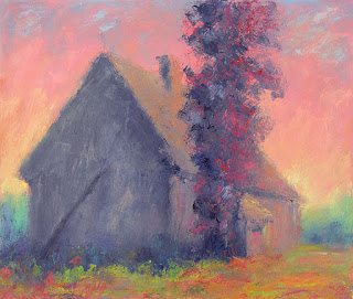
This impetus for this image was a drawing that happened in the way previously described. I've written in previous posts about how I have a stock of compositions in my head that are like tunes to a jazz musician, and I will often engage in improvising variations based on these structures. This image ended up being a variation on one such theme - the old Henderson barn at the intersection of the Wiley Road and the dirt trail that marks where the railroad once was, that I've drawn from direct observation more times than I can remember over the past ten years. I made the drawing almost a year ago and it has been taped up on the studio wall ever since, challenging me to develop it into a painting - a daunting prospect considering the complexity of the strange color scheme that emerged from my subconscious in the wee hours of some cold, late-winter morning. It also marks the return of architectural forms in my paintings, over two years after a conscious decision to eliminate them from my work.

I confess to procrastinating on this one because I doubted my ability to get all of these colors to work together on a large canvas. (I also had some trepidation about including anything that looked even remotely like a barn!) In the end, though, I forged ahead. The work must get done. It was a difficult painting for me, primarily because of the saturation of many of the colors, each with a strong personality, vying for supremacy in the composition, and making it difficult for me to achieve the quality of "inevitability" that is such an important aspect of my work.

Looking back, I realize that I couldn't have made this painting until now. All of the other paintings that I made throughout the year were necessary steps on the journey that led to this one and what looked like procrastination was really just me letting the work unfold the way it was supposed to. Of course, that only works in hindsight and the next difficult image that looms up on my horizon is sure to cause me at least as much stress...

But I'm quite pleased with this one.

Wednesday, December 12, 2018

Unless I Could Wait Forever (oil on canvas, 2018)


(Private Collection)

During my senior year of college, while I was planning for graduate school applications, my advisor suggested that I apply to graduate school as a printmaker rather than a painter because my black and white work was much stronger than my paintings (which was true). She told me that some people just "get" color and others don't and I was going to have to accept the fact that I was one the ones that don't. She said that was okay; I could focus on working in black and white. I was willing to accept this opinion at the time. I ultimately ended up applying to graduate school as a printmaker and the paintings that I did do during that period were essentially monochromatic. But I never really conceded that I couldn't master color. Years later, when I decided to seriously take up painting again, my lack of skill and understanding of how to work with color became immediately (and painfully) apparent. Unwilling to capitulate, I rolled up my sleeves and delved into a serious study of color. For three years I worked tirelessly studying the phenomenon of color-mixing and color relationships. I had taken a Color course at the School of the Museum of Fine Arts with the wonderful Maggie Fitzpatrick, which, based primarily in the theories of Johanas Itten, focused on understanding color as having three components (value, hue, and saturation) and using a 12-step color wheel composed of the three primary colors (yellow, red, blue), three secondary colors (orange, green, violet ¬– mixture of the primaries), and the six intermediate colors resulting from the mixtures of the primaries and secondaries. I read dozens of books on color theory, spent countless hours every night mixing colors and making color wheels and color charts and eventually transcribing paintings of some of my favorite colorists, first in pastel and then in oils, and I made weekly visits to museums and galleries to study the color in great paintings first hand.

And then I started making paintings. Terrible paintings. Dozens and dozens of terrible paintings. But I kept painting and gradually, almost imperceptibly, my paintings got better. Now, more than fifteen years later, I'm pretty fluent in the language of color. I can look at any color and see it's component parts and, although challenging myself with complex color relationships that I've never seen before is an important part of my process – and I relish those challenges – I feel confident in my ability to control the color in my paintings and to achieve the effects that I want, none of which has anything to do with talent or natural ability to "get" color, but is the direct result of a refusal to accept a limitation and to put in as much work as was necessary in order to overcome it.

Color relationships are one of the most important aspects of my work and, really, the primary subject. I always think about the colors for a specific painting before I begin and my process (which I have detailed here in previous posts) involves mixing all of the colors for a painting before I begin to put anything on the canvas.

This painting began with the impulse to make an image that had "brown" as the principle color. (I put the word "brown" in quotations because I think of all colors in terms of their value, hue and saturation and the colors that we usually refer to as browns are really desaturated yellows, oranges and reds.) Of course, as I began mixing my colors, many of them refused to be desaturated and the oranges, reds and red violets defiantly asserted themselves, causing me to increase the saturation of the blues and yellows in order to maintain an overall harmony. The result, quite removed from what I had initially intended, is really a painting based on the triad of primary colors (yellow, red and blue). As an artist, it's important to be able to subjugate our need for control and allow the image's own unique personality to bloom. (The same could be said of parenting!) In the end, that cool green in the bottom section made a surprise appearance and pulled the whole thing together, essentially stealing the show from the primary colors. It's my favorite part of the painting!

Sunday, October 21, 2018

Fall and Rise (oil on canvas 2018)


I know some people who really enjoy painting. They find it relaxing and therapeutic - a positive outlet for creative expression. Sometimes they will tell me that they aren't able to paint as often as they'd like to. They enjoy it, but just don't have the time. Business before pleasure, as the saying goes.

I feel that way about reading. I really enjoy reading, but lately I find it difficult to fit it into my schedule.   Painting, on the other hand, is something I don’t have difficulty finding time to do. I made it a priority many years ago and has become an integral part of my routine. I honestly can’t say that I enjoy it, though.

Whilst working on this painting, I found myself, as I often do, lamenting to the people close to me about how difficult and draining it was. I usually find myself comparing the process to being in some kind of battle or physical conflict. I recently hiked to the summit of Mount Katahdin here in Maine. Katahdin is basically a mile-high pile of boulders and reaching the summit requires a grueling five-mile trek over rugged, rocky terrain, the last mile and a half, the Cathedral Trail, being essentially a vertical climb requiring the near-constant use of all four limbs. Once at the summit, my hike took me across the treacherous Knife Edge, a mile-long arris of jagged rock with steep drops on either side, to Pamola Peak and then a three-and-a-half hour descent over steep rocks (actually the most difficult part of the hike) which brought me back to my car almost nine hours after I'd left. All of this was a walk in the park compared to making a painting. Seriously.

I had summited Katahdin via this route before and, although the unpredictable weather can make each hike a unique experience, I essentially knew what I was in for. At the base of the Cathedral Trail I encountered a few would-be hikers whom I knew were not going to make it to the summit. It's a physically demanding endeavor that requires strength, agility, stamina and courage in equal measure. The majority of deaths on Katahdin are not caused by falls or exposure, but by cardiac arrest, and the mountain won't let you on the summit unless you earn it. Painting, at least for me because my work involves a great deal of improvisation over the basic structure, is the same way. Bringing a painting to fruition successfully requires knowledge of the language of visual form, command of the materials, dexterity, imagination and the courage to take risks. There have been a few rare instances where paintings have come together fairly easily, but more often than not, it's a great struggle and I find myself engulfed in the work for days or weeks, wondering if the image is ever going to coalesce, and hounded by the fear that I might finally have to concede that I'm not fit to be a painter.

Paradoxically, although the process for me is extremely demanding, as well as physically and emotionally exhausting, I still want the finished painting to look as if it came together very organically, with minimal effort. One of my favorite words is "inevitable" and that's exactly the quality that I strive for in my work – that every color, every dab of paint looks as if it were meant to be exactly as it is. Trying to reconcile this objective with my process of working improvisationally and not knowing what the finished image is going to look like until I it's done is a challenge I face every day. But I do it, not because I enjoy it, but because I could never find peace of mind if I didn't do it. I tried for years not to be a painter and I failed miserably at it.

There are days when I'd rather be climbing mountains.